
Design - Pt. 2
The Art of Typography
Hi all! Sarah here. I’m snagging the reins for a moment to continue our discussion about page design. Before I get into specifics, though, I’d like to talk a little about the art of typesetting in general.
Consider the following bit of text:


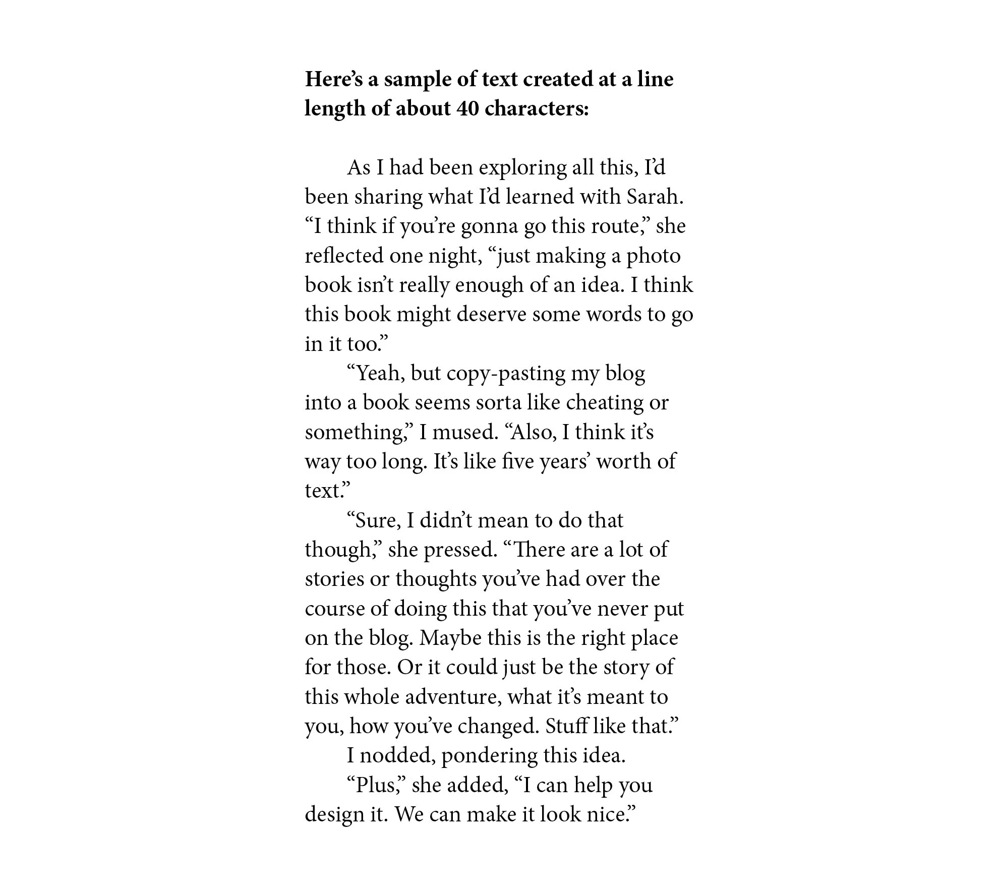
Consider which of the above feels most comfortable to read. In the case of the longer, 90-character lines, the eye gets a little fatigued before it gets to the end of the line, whereas for the shorter, 40-character lines, the eye is constantly having to jump down to see how a given thought resolves. One of these passages has been given too much leash, while another is too confined.
These feelings of discomfort often aren’t articulated by readers; many people just find the experience of reading these passages itchy without knowing why. This is where the art of typesetting becomes important. Just as Allen is considering the voice of our recipes, I’m considering the voice of our design.
It can be tempting to design text such that it calls a lot of attention to itself. I mean, this is my domain on this project, so shouldn’t I really swing for the fences with the typography here? But, let’s look at some examples from cookbooks we have at home:

There’s a lot going on in the above spread; it can be hard to know where to look first. Multiple typefaces, colorful text and accents, and a complex design hierarchy complement a cooking style that’s typically characterized by bold and complex flavors. The voice of the type treatment seems to work with the overall style of cooking presented here.

This example also suggests bold, confident flavors; the text feels loud and challenging, maybe a bit pushy.

One final example. I find the above text beautiful; the page is a piece of art. But the deliberate lack of clear hierarchy or flow might not translate well to content that needs to suggest a clear progression of steps.
To be clear, I really love all of the above examples…we own these books because we love them. But these ways of treating text aren’t really reflective of my personality, nor are they reflective of the voice of Aviary. My design style has always had minimalist tendencies, and I feel this couples well with the needs of the Aviary book. My goal with this book is to let Allen’s photography do the heavy lifting here. My thought is the text should be beautiful and – above all – functional. It should be clean, comfortable and easy to read, to give readers the best chance of success at the recipes. A person should not be struggling to make sense of my text and layout on top of the already-complex recipes themselves (I mean, one of these recipes involves a branding iron. You’re gonna have your hands full enough as it is without having to make sense of bad text layout).
I started design work on this book shortly after Allen and I moved to Chicago last year. At that point, we had very little recipe text to work with, so we needed to make something up to serve as a placeholder. I started by exploring some fairly traditional cookbook layout strategies. Most cookbooks present recipes with all ingredients listed in one cluster, with a separate conversational block of text describing the procedure of the recipe. Here’s how that might have looked in this context:

The problem here is that – as we’ve explained in updates previously – Aviary recipes aren’t really structured like this. The chefs, in seeking measures of efficiency and optimization, tend to break a drink into various components, each of which can be prepared separately and then assembled into the final drink only when it’s needed during service.
Aviary’s recipes, then, consist of a series of component recipes which get assembled in one final step. Similar to the Alinea cookbook, there are multiple recipes within a recipe. This renders a typical cookbook page layout like the one above more clumsy than useful.
Working with this knowledge (though still without final recipes), I tried some other layouts that honored this multi-component structure:


I like many of these, but ultimately had to rule them out once I saw the actual Aviary recipes, which are longer than I anticipated. I realized thin columns and large headers would force our recipes to unnecessarily span multiple pages, which wouldn’t be an efficient use of space. I needed to modify my design hypothesis for the practicalities of this project.